
 Fake News Detection Project
- 34 mins Personal Project
Playing around with Natural Language Processing (NLP) and LSTM Neural Networks (NN)
What is Fake News?
‘Fake News’ could broadly be described as false or misleading information posing as true or legitimate news. The story is fabricated with no verifiable facts, sources or quotes. ‘Fake News’ is part of a larger category of mis- and disinformation.
Let’s Begin
Importing (and/or installing) all the libraries needed for this project
# Libraries

import pandas as pd
import numpy as np

import matplotlib.pyplot as plt
import seaborn as sns
from wordcloud import WordCloud, STOPWORDS
import plotly.express as px
import plotly.graph_objects as go
import plotly.offline as pyo
#import plotly.io as pio

import re

#from jupyterthemes import jtplot
#jtplot.style(theme='monokai', context='notebook', ticks=True, grid=False)
# setting the style of the notebook to be monokai theme
# this theme helps make the x and y axes labels clearly on plots which are black on black

from PIL import Image

from sklearn.model_selection import train_test_split
from sklearn.metrics import accuracy_score
from sklearn.metrics import confusion_matrix, classification_report
from sklearn.feature_extraction.text import CountVectorizer

import nltk
from nltk.stem import PorterStemmer, WordNetLemmatizer
from nltk.corpus import stopwords
from nltk.tokenize import word_tokenize, sent_tokenize

nltk.download('punkt')

from bs4 import BeautifulSoup

import string
from string import punctuation
from collections import Counter

import gensim
from gensim.utils import simple_preprocess
from gensim.parsing.preprocessing import STOPWORDS

import tensorflow as tf
from tensorflow.keras.preprocessing.text import one_hot, Tokenizer
from tensorflow.keras.preprocessing.sequence import pad_sequences
from tensorflow.keras.models import Sequential
from tensorflow.keras.layers import Dense, Flatten, Embedding, Input, LSTM, Conv1D, MaxPool1D, Bidirectional, LSTM, Dropout
from tensorflow.keras.models import Model
from tensorflow.keras.callbacks import ReduceLROnPlateau
from tensorflow.keras.optimizers import Adam
Importing, viewing and wrangling both real and fake news datasets
# Load both real and fake news data files
df_real = pd.read_csv("../data/True.csv")
df_fake = pd.read_csv("../data/Fake.csv")
# Dimensions of the news datasets
print(df_real.shape)
print(df_fake.shape)

# Quick summary of real news dataset
df_real.info()
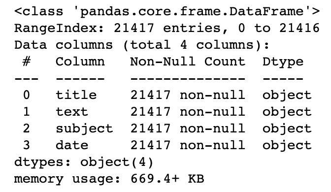
# Quick summary of fake news dataset
df_fake.info()
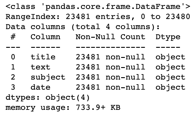
print("Number of rows in real news dataframe: ", len(df_real))
print("Number of rows in fake news dataframe: ", len(df_fake))

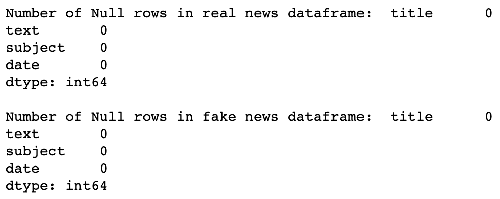
print("Number of Null rows in real news dataframe: ", df_real.isnull().sum())
print("\r")
print("Number of Null rows in fake news dataframe: ", df_fake.isnull().sum())
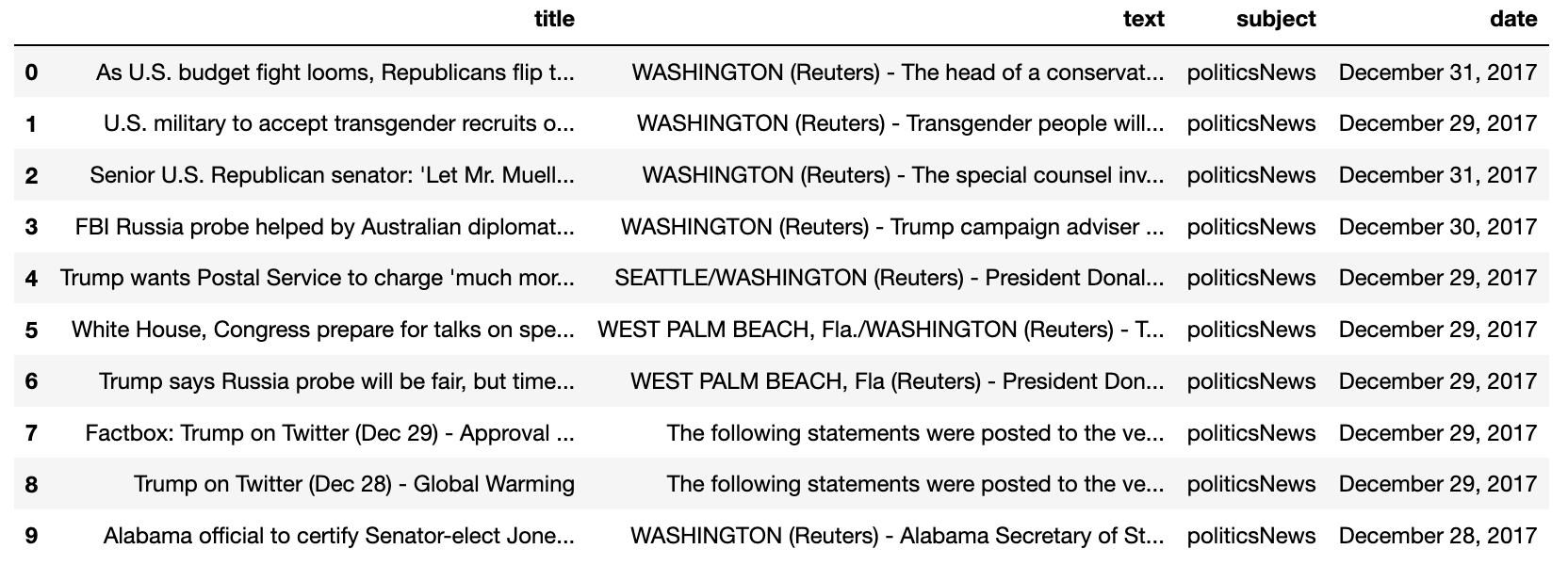
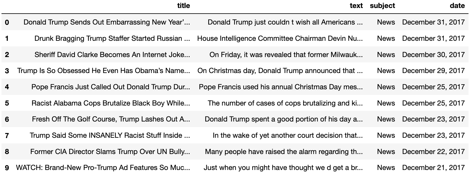
# View true news data
df_real.head(10)
# View fake news data
df_fake.head(10)
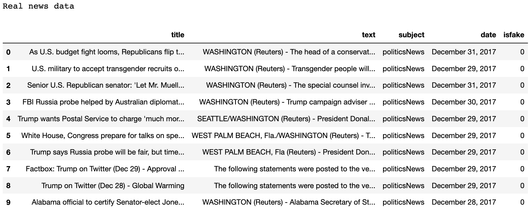
# Add a isfake target column to real news df to indicate whether the news is real ie isfake=0 (not fake)
print("Real news data")
df_real['isfake'] = 0
df_real.head(10)
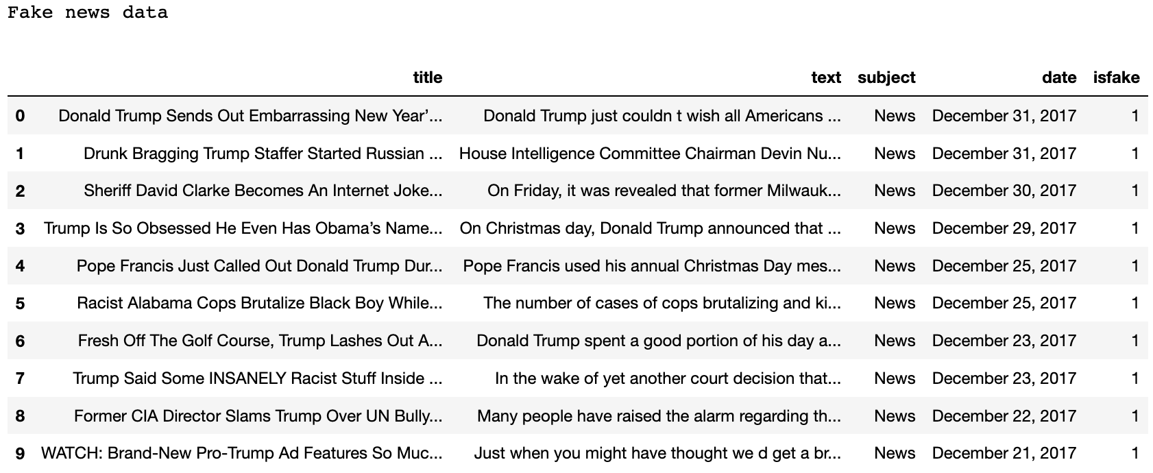
# Add a isfake target column to fake news df to indicate whether the news is real ie isfake=1 (is fake)
print("Fake news data")
df_fake['isfake'] = 1
df_fake.head(10)
# Function to count the total twitter username mentions
def twitter_username_count(df):
    twitter_username = re.compile(r'@([A-Za-z0-9_]+)')
    count = 0
    list_ = []
    for name in df['text']:
        count += len(re.findall(twitter_username, name))
    return count
# Checking the total number of twitter username mentions in both datasets
twitter_fake_usernames = twitter_username_count(df_fake)
twitter_real_usernames = twitter_username_count(df_real)

print("The number of twitter usernames in the real data: " + str(twitter_real_usernames))
print("The number of twitter usernames in the fake data: " + str(twitter_fake_usernames))

An interesting initial observation is the number of mentions of @ twitter users in the fake news dataset compared to the real dataset. This could be considered as a bias in the fake dataset, but preprocessing the news datasets would remove this bias anyway.
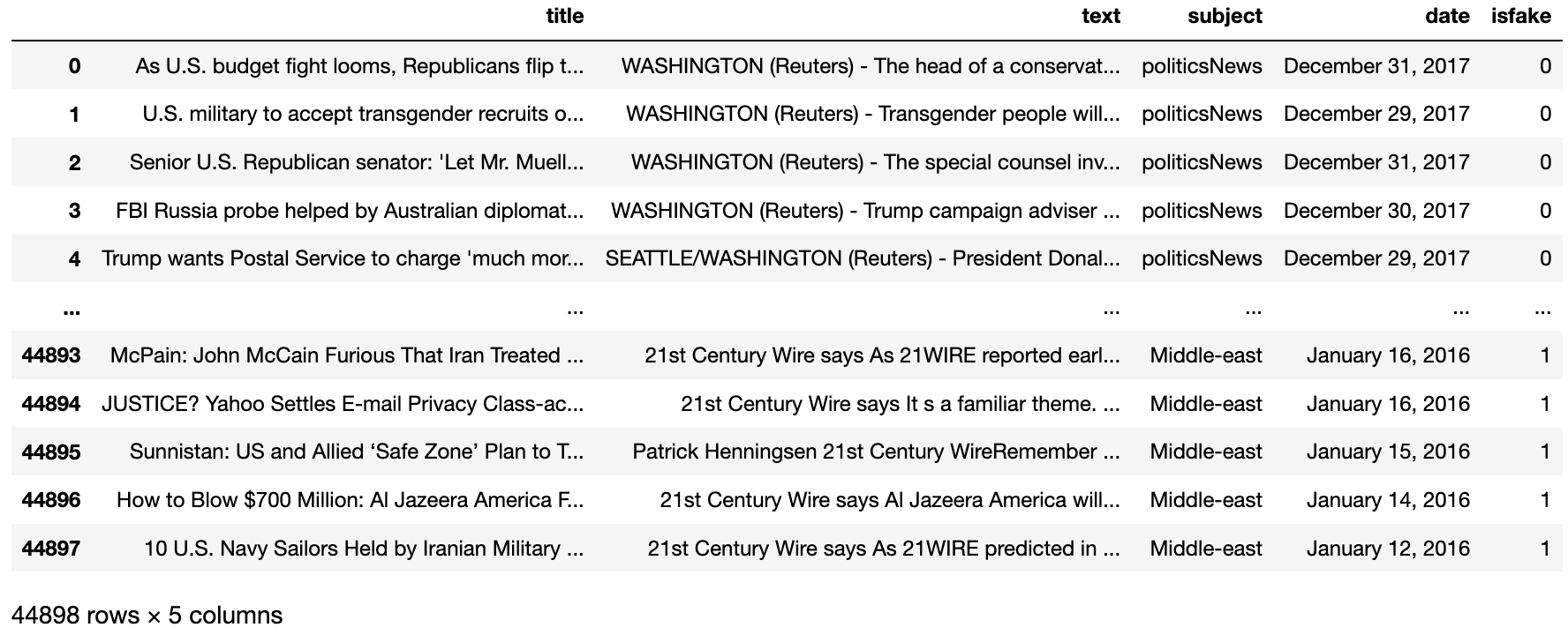
# Join both real and fake news into 1 dataset and reset the index
df_allnews = pd.concat([df_real, df_fake]).reset_index(drop = True)
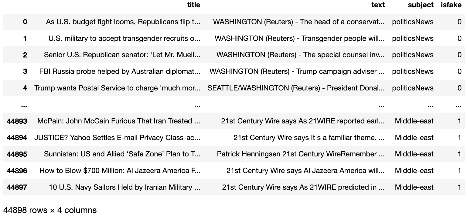
df_allnews
# Get rid of date column (provides no value during for this project).
# Inplace=true to make sure the column is dropped permanently in memory as well.
df_allnews.drop(columns = ['date'], inplace = True)
df_allnews
Visualizing the distribution of real and fake articles in the data
# Countplot of the breakdown in the subject column
# Notice the plot shows that the dataset is almost balanced between real and fake news
plt.figure(figsize = (8, 8))
ax = sns.countplot(data = df_allnews, x = "isfake")
ax.set_title("The number of real vs fake articles countplot")
ax.set(xlabel = "Article Type")
plt.show()
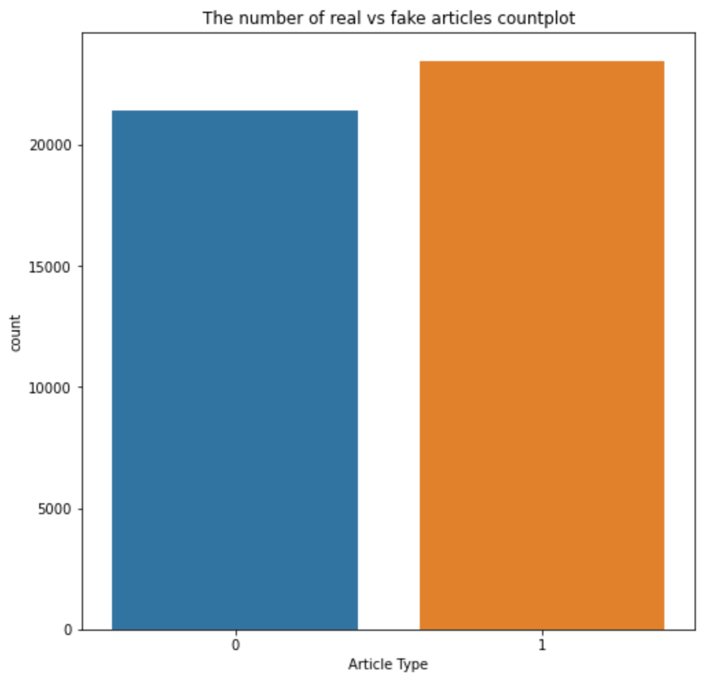
Notice how the dataset of real and fake news articles are pretty much balanced
# Countplot of the breakdown of samples in the subject column
plt.figure(figsize = (12, 8))
sns.set(style = "whitegrid",font_scale = 1.2)
ax2 = sns.countplot(data = df_allnews, x = "subject", hue = "isfake")
ax2.set_xticklabels(ax2.get_xticklabels(),rotation=90)
ax2.set_title("Breakdown of the subject matter of all articles countplot")
ax2.set(xlabel = "Subject of Article")
ax2.set(ylabel = "Count")
plt.show()
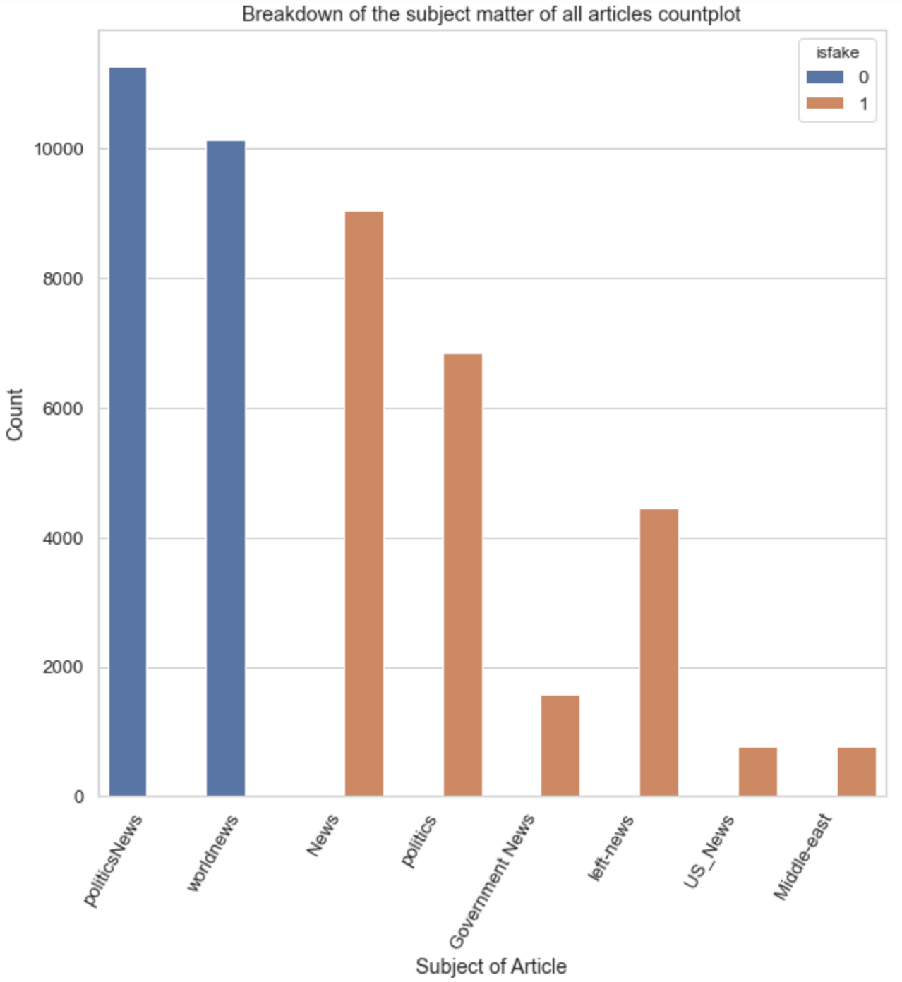
Notice how the categories are distributed along real and fake articles. This will ultimately correlate with the classification of real or fake articles and will easily be picked up by the prediction model. Thus, categories will not be combined with the fullarticle below.
# Combine title and body of news article together into a new column called fullarticle
df_allnews['fullarticle'] = df_allnews['title'] + ' ' + df_allnews['text']
df_allnews.head(10)
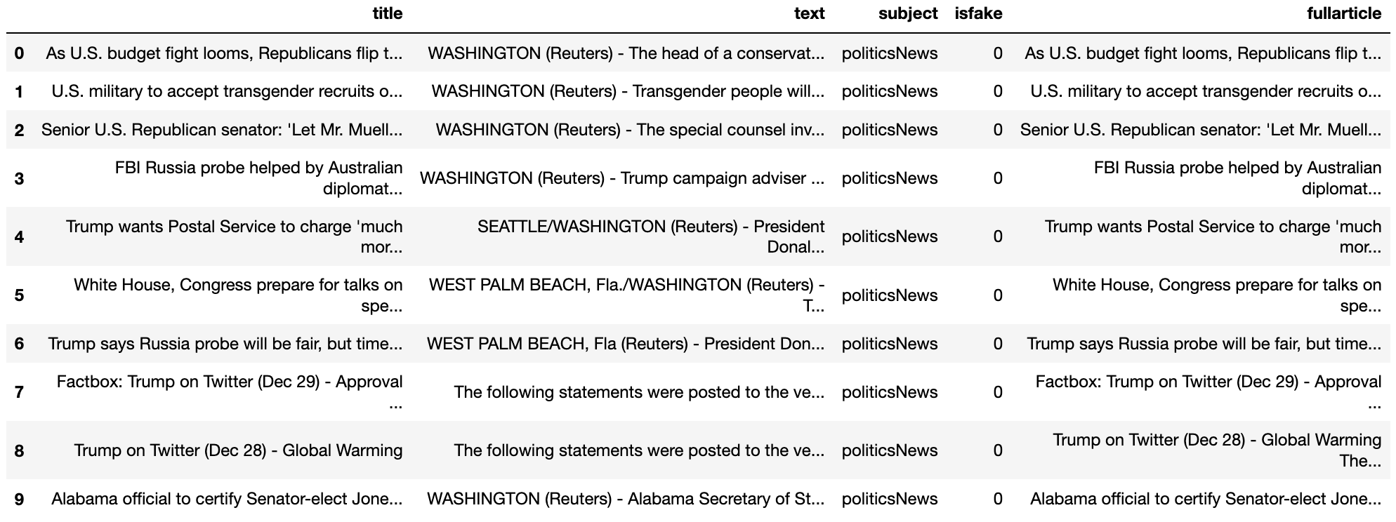
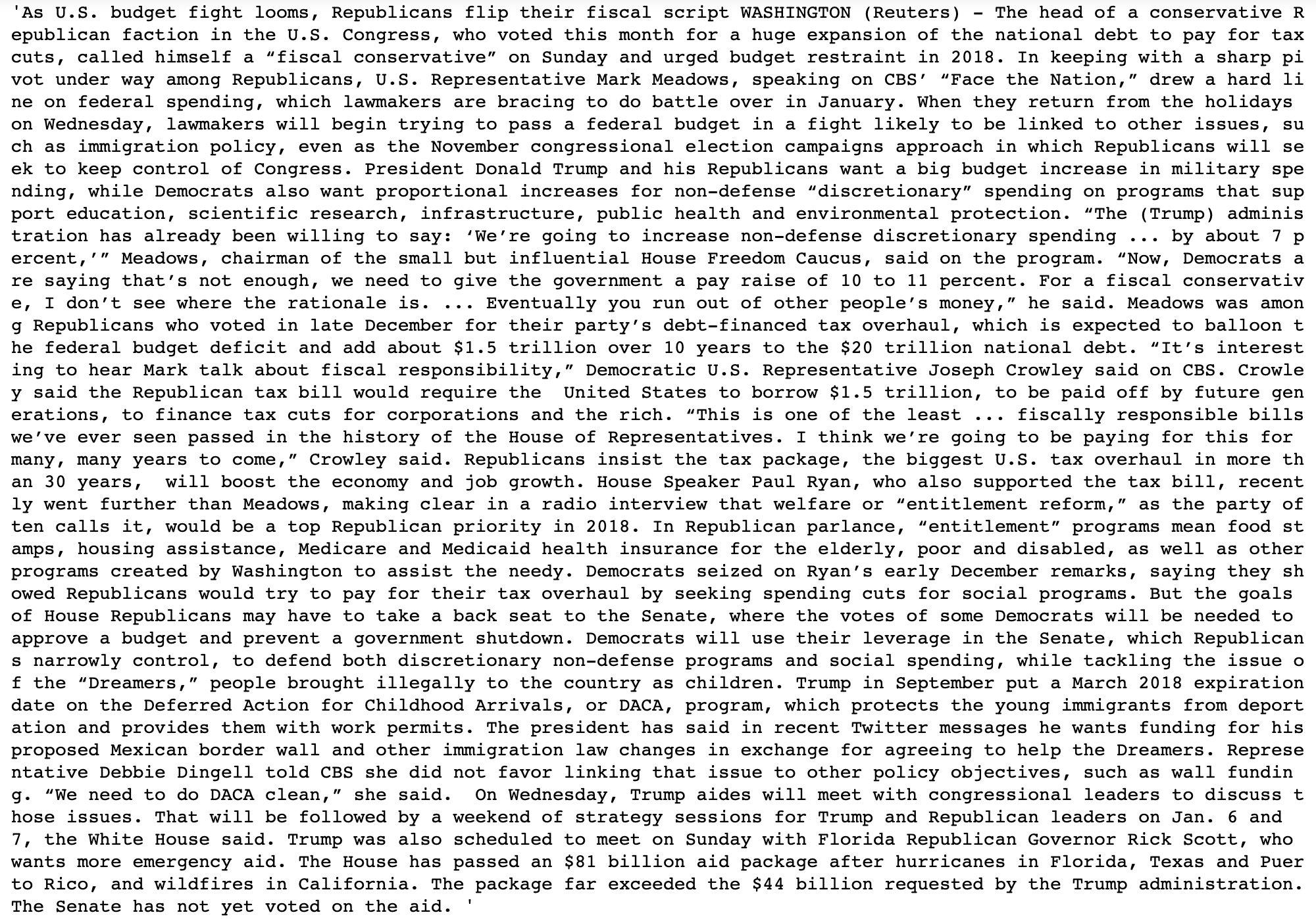
# Check to make sure that the title and body are combined into 1 column
df_allnews['fullarticle'][0]
Downloading stopwords
i.e. words which do not add much meaning to a sentence and can safely be removed without sacrificing the meaning of the sentence. For example words such as: the, he, have etc.
# Download stopwords
nltk.download("stopwords")
# Adding stopwords
stop_words = set(stopwords.words('english'))
#stop_words

# Adding punctuation to the stopwords list
punctuation = list(string.punctuation)
stop_words.update(punctuation)
#stop_words
Preprocessing the data
# Lets pre-clean the article text a little
# Remove html elements
def remove_html(text):
    soup = BeautifulSoup(text, "html.parser")
    return soup.get_text()

# Remove square brackets with Regular Expression
def remove_square_brackets(text):
    return re.sub('\[[^]]*\]', '', text)

# Remove URLs with Regular Expression
def remove_urls(text):
    return re.sub(r'http\S+', '', text)

def lowercase(text):
    return text.lower()

def remove_stopwords(text):
    final_text = []
    for i in text.split():
        if i.strip().lower() not in stop_words:
            final_text.append(i.strip())
    return " ".join(final_text)

def lemmatize(text):
    lemm = nltk.stem.WordNetLemmatizer()
    return lemm.lemmatize(text)
    #return [lemm.lemmatize(text) for word in text if word not in stop_words]

# Pre-cleaning of text
def pre_clean(text):
    text = remove_html(text)
    text = remove_square_brackets(text)
    text = remove_urls(text)
    text = lowercase(text)
    text = remove_stopwords(text)
    text = lemmatize(text)
    return text


# Apply pre-clean function
df_allnews['clean'] = df_allnews['fullarticle'].apply(pre_clean)
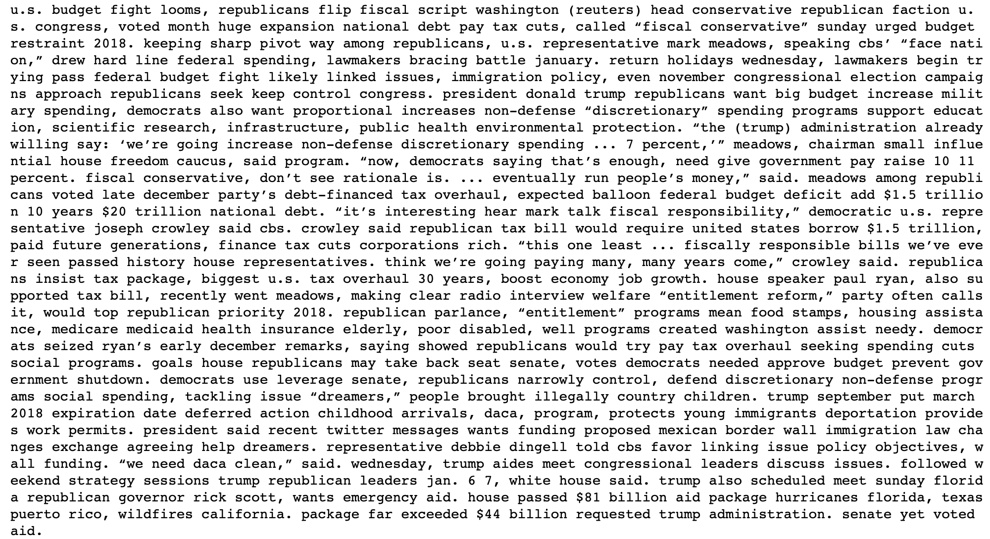
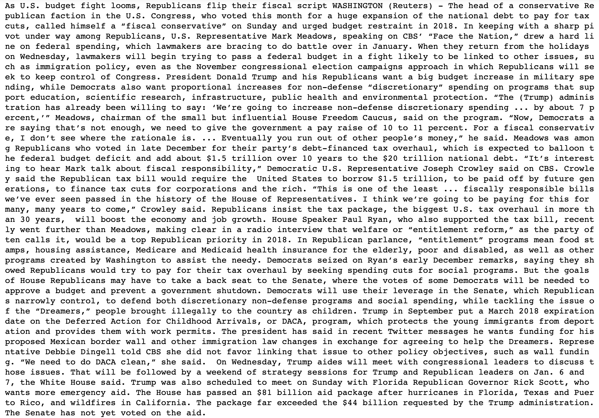
# Comparing the cleaned data to the original
print(df_allnews['clean'][0])
print(df_allnews['fullarticle'][0])
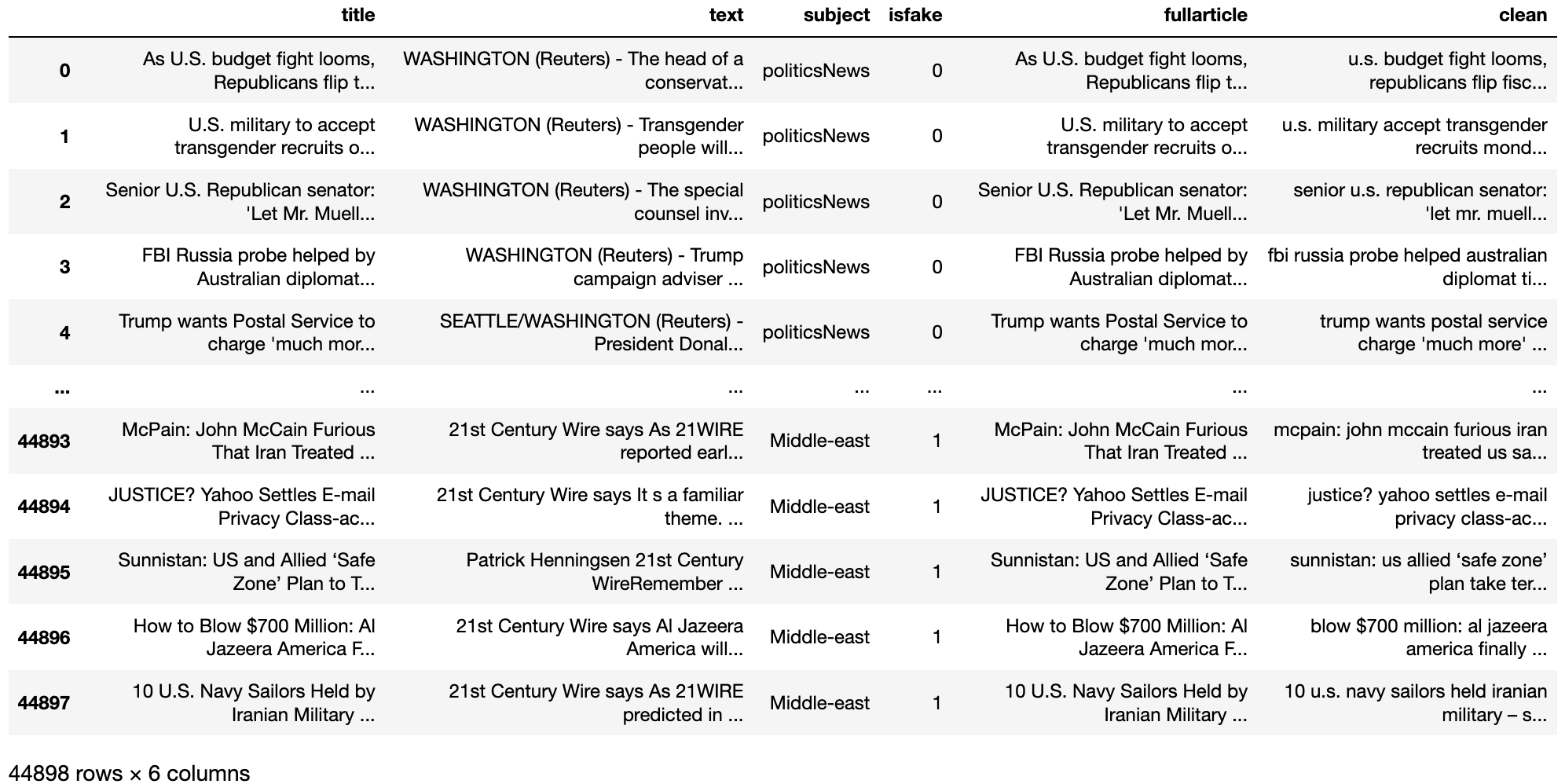
# Showing the updated dataset
df_allnews
Visualizing data
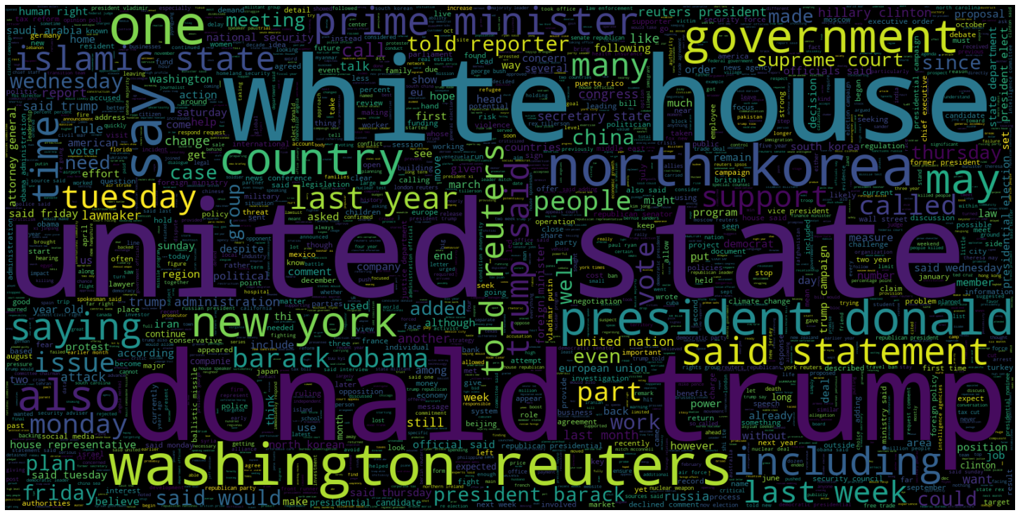
Word clouds!
Word cloud are a visualization of the most common single words in a dataset. The most frequent words are shown by the font size or color.
# Creating a word cloud plot for articles that are real (isfake = 0)
plt.figure(figsize = (20, 20))
wc = WordCloud(max_words = 2000, width = 1600, height = 800,
stopwords = stop_words).generate(" ".join(df_allnews[df_allnews.isfake == 0].clean))
plt.imshow(wc, interpolation = 'bilinear')
plt.axis('off')
plt.tight_layout(pad = 0)
plt.show()
# Creating a word cloud plot for articles that are fake (isfake = 1)
plt.figure(figsize = (20, 20))
wc = WordCloud(max_words = 2000, width = 1600, height = 800,
stopwords = stop_words).generate(" ".join(df_allnews[df_allnews.isfake == 1].clean))
plt.imshow(wc, interpolation = 'bilinear')
plt.axis('off')
plt.tight_layout(pad = 0)
plt.show()

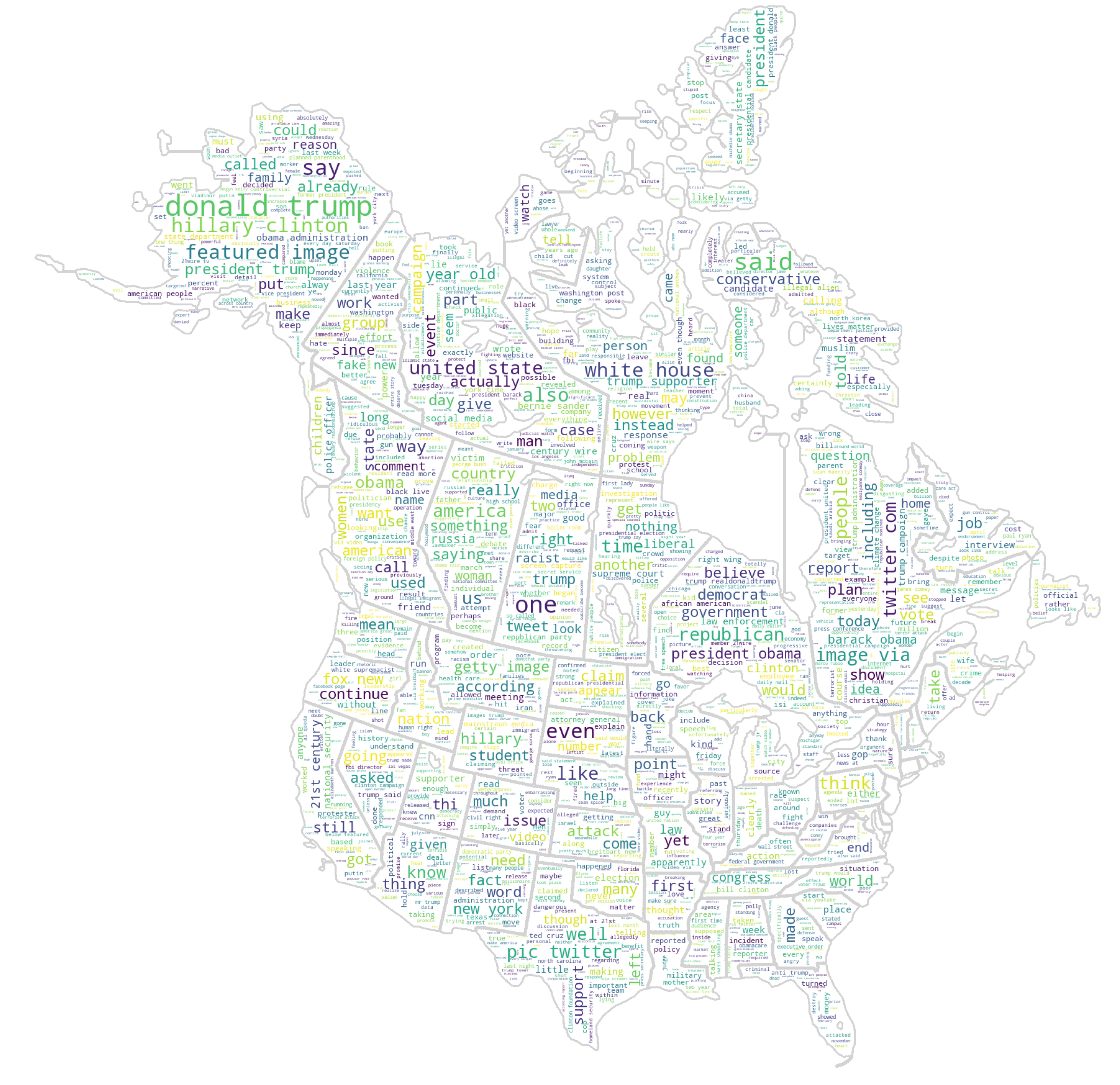
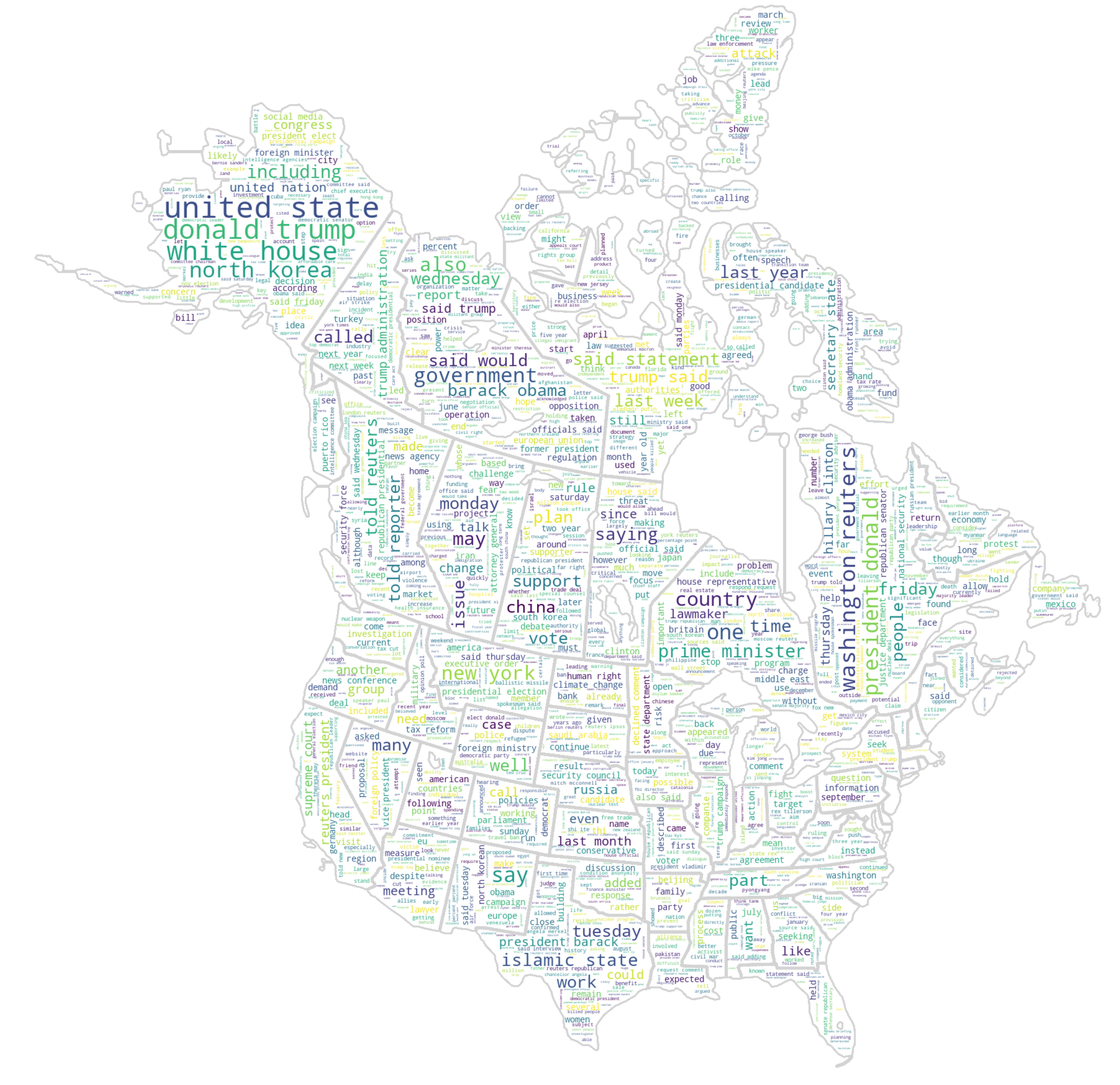
Lets have some fun with word cloud masks !!
# Creating a custom word cloud plot for articles that are fake (isfake = 1)
mask = np.array(Image.open('../imgs/USACanada_BlankMap.png'))

wc_fun = WordCloud(stopwords = stop_words, mask = mask, background_color = "white", max_words = 2000, max_font_size = 256, contour_width = 2, contour_color = 'lightgrey', random_state = 42).generate(" ".join(df_allnews[df_allnews.isfake == 1].clean))
#width=mask.shape[1],
#height=mask.shape[0]).generate(" ".join(df_allnews[df_allnews.isfake == 1].clean))
#wc.generate(article.text)
plt.figure(figsize=[200,100])
plt.imshow(wc_fun, interpolation="bilinear")
plt.axis('off')
plt.tight_layout(pad = 0)
plt.show()
# Creating a custom word cloud plot for articles that are real (isfake = 0)
wc_fun = WordCloud(stopwords = stop_words, mask = mask, background_color = "white", max_words = 2000, max_font_size = 256, contour_width = 3, contour_color = 'lightgrey', random_state = 42).generate(" ".join(df_allnews[df_allnews.isfake == 0].clean))
#width=mask.shape[1],
#height=mask.shape[0]).generate(" ".join(df_allnews[df_allnews.isfake == 0].clean))
#wc.generate(article.text)
plt.figure(figsize=[200,100])
plt.imshow(wc_fun, interpolation="bilinear")
plt.axis('off')
plt.tight_layout(pad = 0)
plt.show()
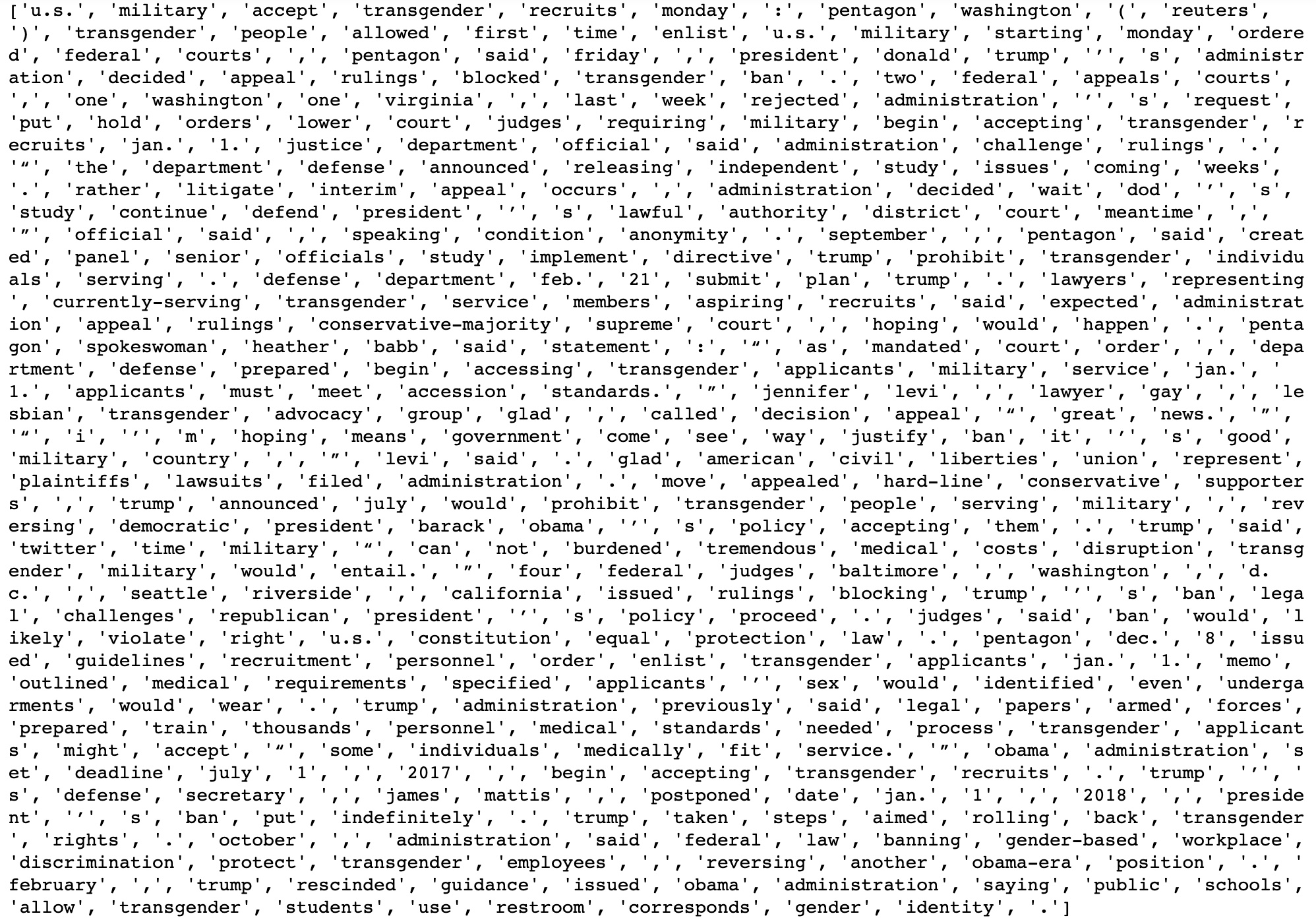
Creating a tokenizer to break up (tokenize) the words
# Creating tokens ie breaking up into unique words
print(nltk.word_tokenize(df_allnews['clean'][1]))
# Getting the maximum article length.
max_len = -1
for article in df_allnews.clean:
    tokens = nltk.word_tokenize(article) # creates the tokens ie every unique word
    if(max_len < len(tokens)):
        max_len = len(tokens)
print("The maximum number of words in any article is =", max_len)

# Using plotly to create a histogram (interactable) for the distribution of number of words in an article
maxLengthPlot = px.histogram(x = [len(nltk.word_tokenize(x)) for x in df_allnews.clean], title='Distribution of Total Number of Words Per Article', labels={'x':'Number of Words Per Article'}, nbins = 100)
maxLengthPlot.show("notebook") # Forces the notebook renderer to reload to show plot
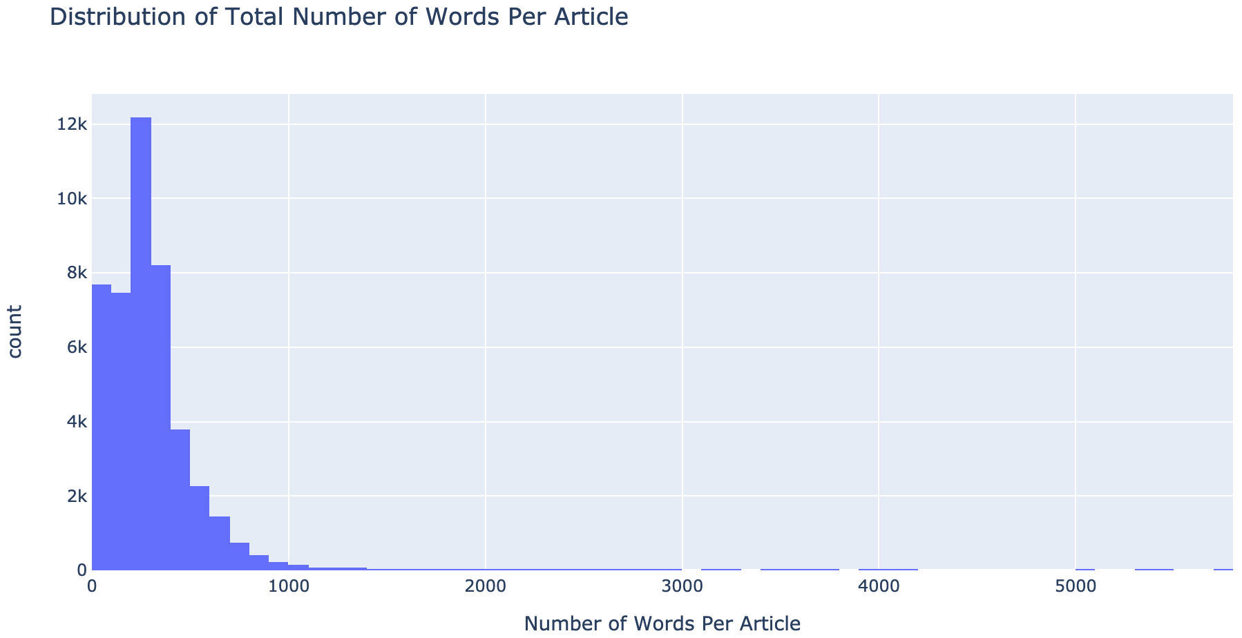
Notice articles with 200-299 words make up the peak of all the articles
Now let’s look at the distribution of the number of characters in the articles
# Plots which show the number of characters in both real and fake articles
fig,(ax1,ax2) = plt.subplots(1, 2, figsize = (12, 8))
article_length = df_allnews[df_allnews['isfake'] == 0]['clean'].str.len()
ax1.hist(article_length, color = 'green')
ax1.set_title('Real Articles')
article_length = df_allnews[df_allnews['isfake'] == 1]['clean'].str.len()
ax2.hist(article_length, color = 'red')
ax2.set_title('Fake Articles')
fig.suptitle('Number of characters in articles')
plt.show()
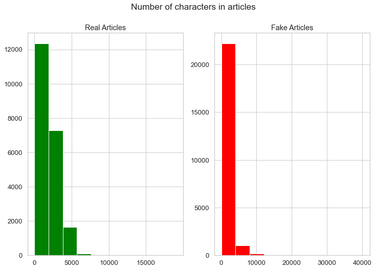
Notice the distribution of the most common number of characters in both real and fake articles are different from each other.
Number of words in real and fake articles
# Plots which show the number of words in both real and fake articles
fig,(ax1,ax2) = plt.subplots(1, 2, figsize = (12, 8))
article_length = df_allnews[df_allnews['isfake'] == 0]['text'].str.split().map(lambda x: len(x))
ax1.hist(article_length,color = 'green')
ax1.set_title('Real Article')
article_length = df_allnews[df_allnews['isfake'] == 1]['text'].str.split().map(lambda x: len(x))
ax2.hist(article_length,color = 'red')
ax2.set_title('Fake Article')
fig.suptitle('Number of words in articles')
plt.show()
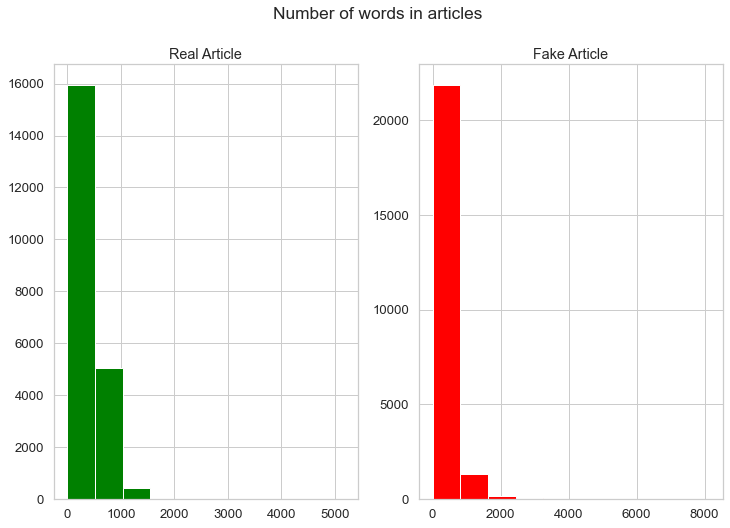
Again, notice that real and fake articles have different average word lengths
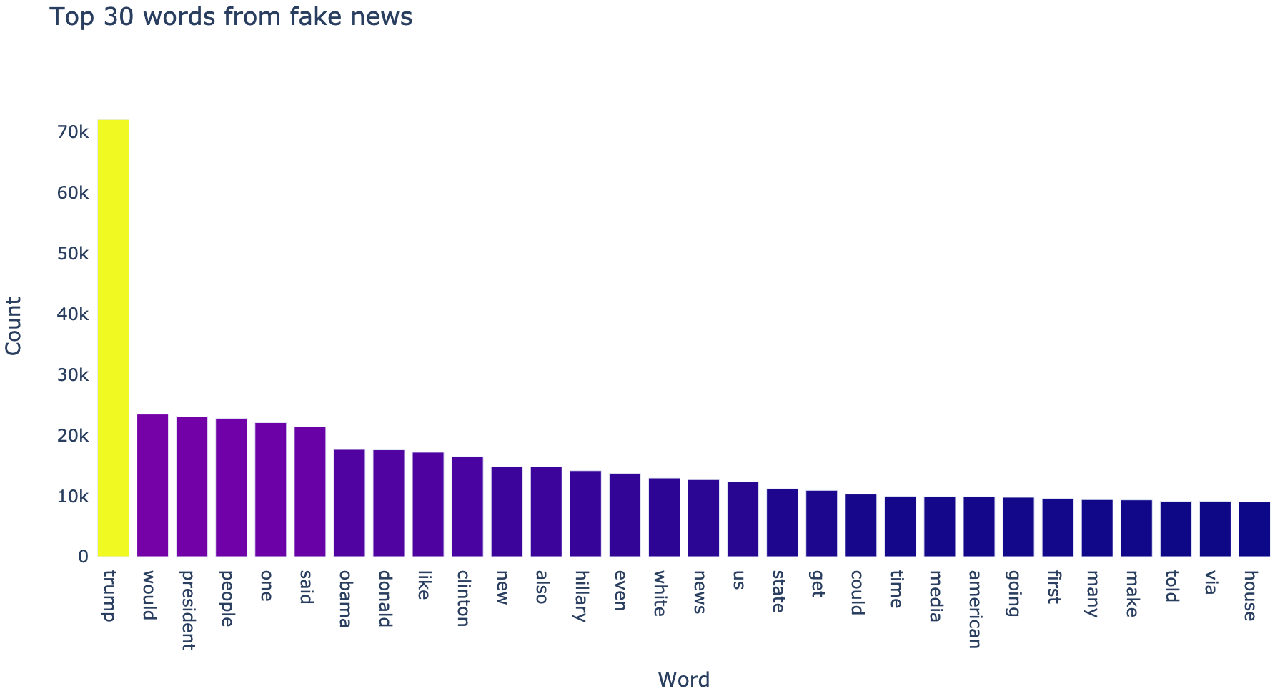
Let’s look at the top 30 words in both real and fake articles
# Top 30 words in the real articles
df_news_real = pd.DataFrame(pd.Series(' '.join(df_allnews[df_allnews['isfake'] == 0]['clean']).split()).value_counts()).head(30)

plot_data = [
    go.Bar(
        x = df_news_real.index,
        y = df_news_real[0],
        marker = dict(color = df_news_real[0])
    )
]
plot_layout = go.Layout(
        title='Top 30 words from real news',
        yaxis_title='Count',
        xaxis_title='Word',
        plot_bgcolor='rgba(0,0,0,0)'
    )
fig = go.Figure(data=plot_data, layout=plot_layout)
pyo.iplot(fig)
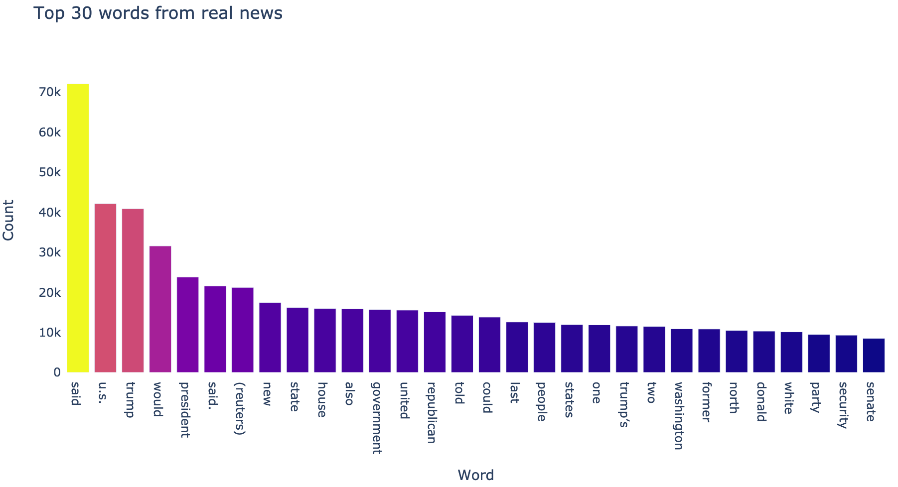
# Top 30 words in the fake articles
df_news_fake = pd.DataFrame(pd.Series(' '.join(df_allnews[df_allnews['isfake'] == 1]['clean']).split()).value_counts()).head(30)

plot_data = [
    go.Bar(
        x = df_news_fake.index,
        y = df_news_fake[0],
        marker = dict(color = df_news_fake[0])
    )
]
plot_layout = go.Layout(
        title='Top 30 words from fake news',
        yaxis_title='Count',
        xaxis_title='Word',
        plot_bgcolor='rgba(0,0,0,0)'
    )
fig = go.Figure(data=plot_data, layout=plot_layout)
pyo.iplot(fig)
# Function to create a corpus and count the frequency of each word in all the articles
# Dsiplay 1st 5 words in the corpus
def get_corpus(text):
    words = []
    for i in text:
        for j in i.split():
            words.append(j.strip())
    return words
corpus = get_corpus(df_allnews.clean)
corpus[:5]

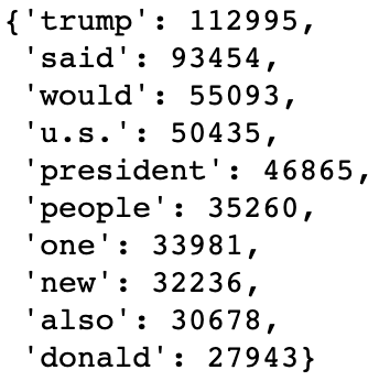
# Check the most common words with their counts
counter = Counter(corpus)
most_common = counter.most_common(10)
most_common = dict(most_common)
most_common
N-grams
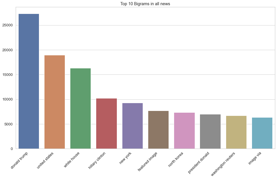
Basically, a N-gram is a sequence of ‘N’ words. For example, “Data Science” is a bigram (2 words in sequence) and “Machine Learning Project ” is a trigram (3 words in sequence)
# A function to return the most common n-grams
def top_ngrams(corpus, n, g):
    vec = CountVectorizer(ngram_range = (g, g)).fit(corpus)
    bag_of_words = vec.transform(corpus)
    sum_words = bag_of_words.sum(axis = 0)
    words_freq = [(word, sum_words[0, idx]) for word, idx in vec.vocabulary_.items()]
    words_freq = sorted(words_freq, key = lambda x: x[1], reverse = True)
    return words_freq[:n]
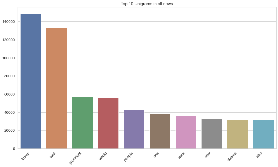
# Unigram (1 word sequence) Analysis
plt.figure(figsize = (16, 9))
top_unigrams = top_ngrams(df_allnews.clean, 10, 1)
unigram_chart = dict(top_unigrams)
unigram_chart = sns.barplot(x = list(unigram_chart.keys()), y = list(unigram_chart.values()))
unigram_chart.set_xticklabels(unigram_chart.get_xticklabels(), rotation = 45, horizontalalignment = 'right')
unigram_chart.set_title("Top 10 Unigrams in all news")
plt.show()
# Bigram (2 word sequence) Analysis
plt.figure(figsize = (16, 9))
top_bigrams = top_ngrams(df_allnews.clean, 10, 2)
bigram_chart = dict(top_bigrams)
bigram_chart = sns.barplot(x = list(bigram_chart.keys()), y = list(bigram_chart.values()))
bigram_chart.set_xticklabels(bigram_chart.get_xticklabels(), rotation = 45, horizontalalignment = 'right')
bigram_chart.set_title("Top 10 Bigrams in all news")
plt.show()
# Trigram (3 word sequence) Analysis
plt.figure(figsize = (16, 9))
top_trigrams = top_ngrams(df_allnews.clean, 10, 3)
trigram_chart = dict(top_trigrams)
trigram_chart = sns.barplot(x = list(trigram_chart.keys()), y = list(trigram_chart.values()))
trigram_chart.set_xticklabels(trigram_chart.get_xticklabels(), rotation = 45, horizontalalignment = 'right')
trigram_chart.set_title("Top 10 Trigrams in all news")
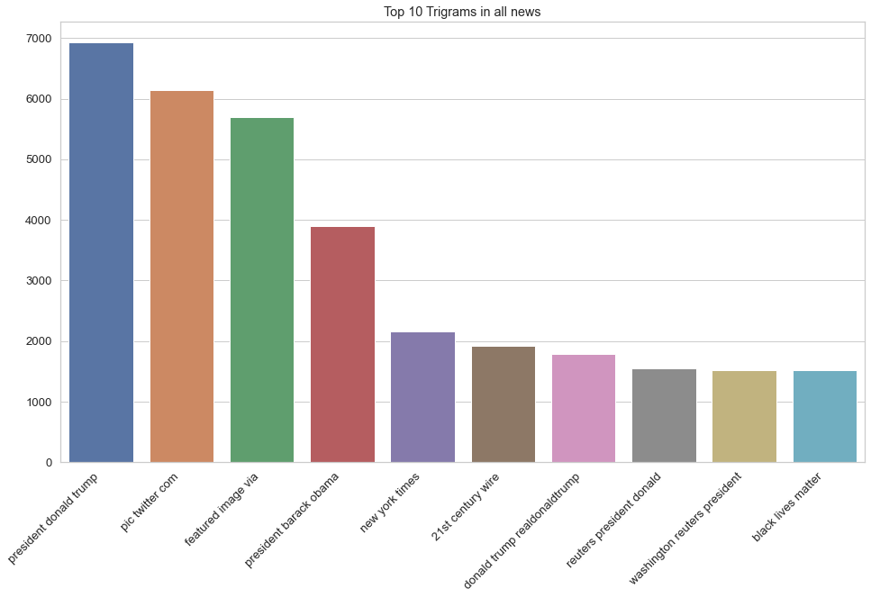
Notice what the most frequently mentioned word(s) is(are). Surprised? :-P
Modeling with Neural Networks
# Splitting data into train (80%) and test (20%) sets, x/input is the 'clean' column data,
# y/target/output is ithe sfake column data (what we are predicting)
x_train, X_test, y_train, y_test = train_test_split(df_allnews.clean, df_allnews.isfake, test_size = 0.2)
# Creating a tokenizer to break up (tokenize) the words into a sequences of tokenized words

# Defining some parameters
max_features = 100000
maxlength = 40

tokenizer = Tokenizer(num_words = max_features)
tokenizer.fit_on_texts(x_train) # Creates the vocabulary
tokenized_train = tokenizer.texts_to_sequences(x_train) # Creates the sequence of integers

# Adding padding can either be maxlength = 4406 (from above) or smaller number maxlength = 40 seems to work
# well based on results
# Pad sequences make all news articles the same length
x_train = pad_sequences(tokenized_train, maxlen = maxlength, padding = 'post', truncating = 'post')
# Let's do the same thing but tokenize the test data
tokenized_test = tokenizer.texts_to_sequences(X_test) # Creates the sequence of integers
X_test = pad_sequences(tokenized_test, maxlen = maxlength, truncating = 'post')
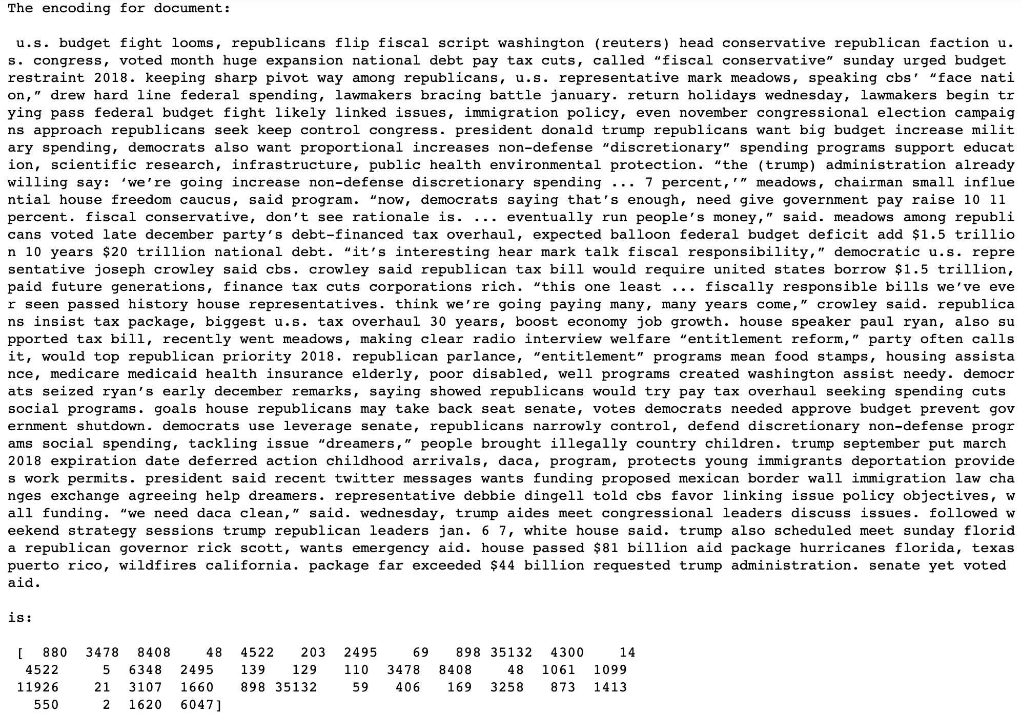
# Lets compare the cleaned article to the tokenized and padded article
print("The encoding for document: \n\n", df_allnews.clean[0], "\n\nis:\n\n", x_train[0])
Training the model
# Defining some more model parameters
batch_size = 64
epochs = 10
embedding_size = 128
val_split = 0.1
# ReduceLROnPlateau reduces the learning rate when a metric has stopped improving.
# Models can often benefit from reducing the learning rate. This monitors the quantity, if there is no improvement
# in the 'patience' parameter number of epochs, the learning rate is reduced.
learning_rate_reduction = ReduceLROnPlateau(monitor = 'val_accuracy', patience = 2,
verbose = 1,factor = 0.5, min_lr = 0.00001)
Defining the Neural Network by initializing the sequential model
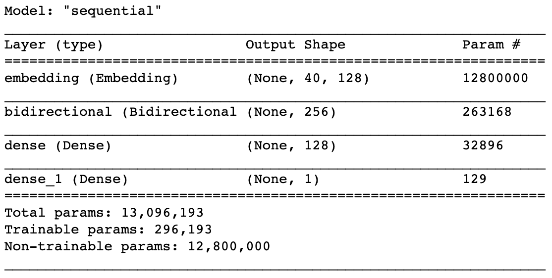
fakenews_model = Sequential()

# Adding the non-trainable embedding layer
fakenews_model.add(Embedding(max_features, output_dim = embedding_size, input_length = maxlength, trainable = False))
# fakenews_model.add(Embedding(total_words, output_dim = 240))

# Building a Bi-Directional RNN and LSTM model
fakenews_model.add(Bidirectional(LSTM(128)))

# Adding Dense layers
fakenews_model.add(Dense(128, activation = 'relu')) # adding 128 dense layers with relu activation
# Output is only 1 neuron, why? Essentially doing binary classification with an output of 0 or 1
fakenews_model.add(Dense(1,activation= 'sigmoid')) # adding dense of 1 neuron with sigmoid activation
# compiling model with adam optimizer and binary crossentropy loss with metrics being accuracy
fakenews_model.compile(optimizer='adam', loss='binary_crossentropy', metrics=['accuracy'])
fakenews_model.summary()

# have approx 13Mil trainable parameters
# embedding layer for dimensionality reduction
# LSTM layer (bidirectional layer)
# 2 dense layers
# Converting y_train to a NumPy array, this is an important step before passing to the model (only accepts as an array)
y_train = np.asarray(y_train)
y_test = np.asarray(y_test)
# train the model
# input - x_train, output - y_train
# Validation set as 10% of training data for cross validation, 90% for training
# Running 10 epochs
# if error is going down on both training and validation, thats good, it means model is able to generalize
# if error is going down for training but going up in validation, it means the model is overfitting the training data
model_history = fakenews_model.fit(x_train, y_train, batch_size = batch_size, validation_split = val_split, epochs = epochs, callbacks = [learning_rate_reduction])
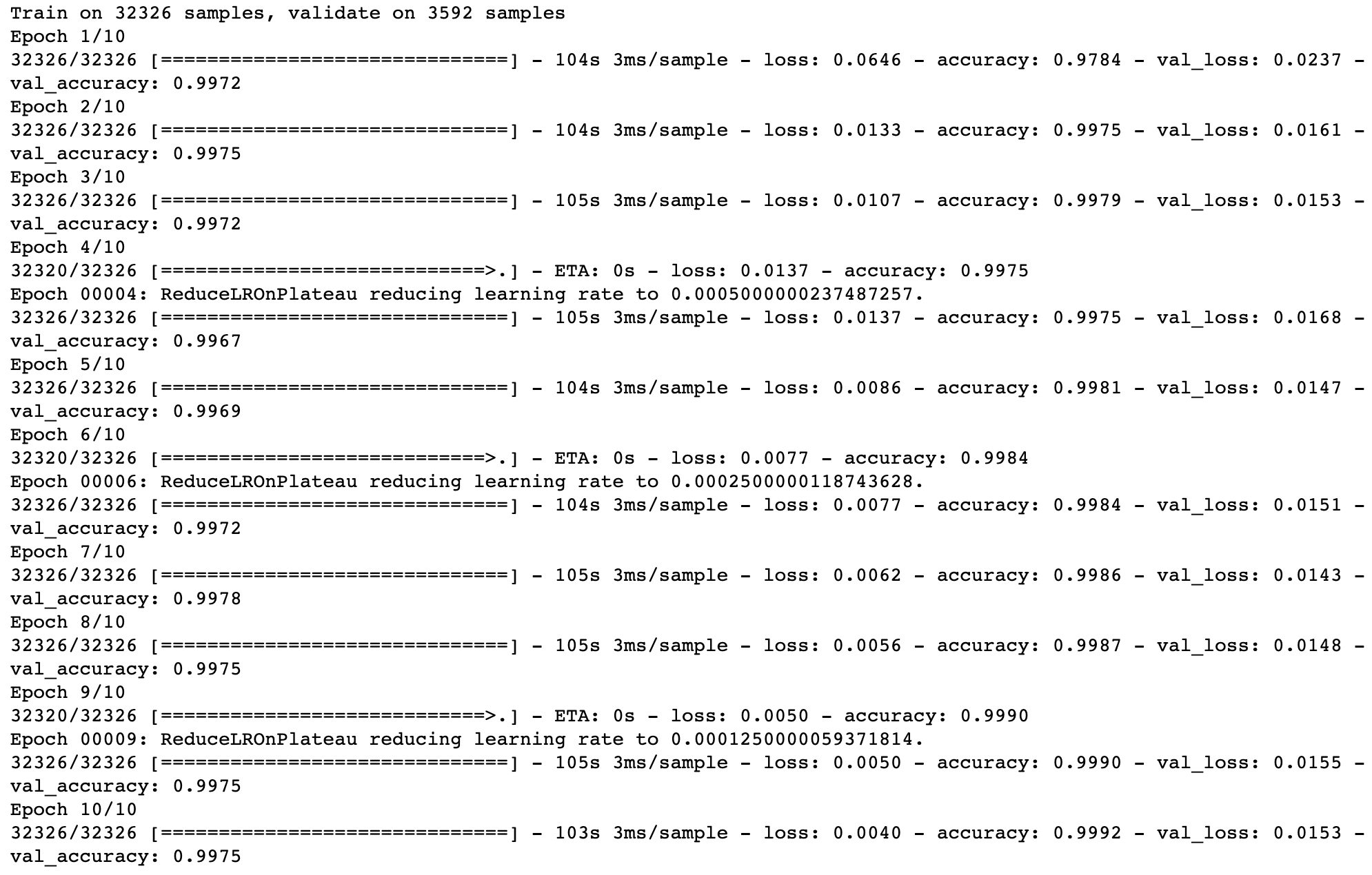
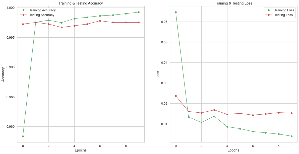
Notice the amazing performance! Accuracy ~99% for train and test. Losses also drop for both.
Evaluating the results after training the model
# Checking the accuracy (percent) of the model on the train data
results_train = fakenews_model.evaluate(x_train, y_train, verbose = 0)
print("The accuracy of the model on training data is: " , results_train[1]*100, "%")

# Checking the accuracy (percent) of the model on the test data
results_test = fakenews_model.evaluate(X_test, y_test, verbose = 0)
print("The accuracy of the model on testing data is: " , results_test[1]*100, "%")

# Plotting the epochs vs all the predicted scores from the model
epochs = [i for i in range(10)]
fig , ax = plt.subplots(1,2)
train_acc = fakenews_model.history.history['accuracy']
train_loss = fakenews_model.history.history['loss']
val_acc = fakenews_model.history.history['val_accuracy']
val_loss = fakenews_model.history.history['val_loss']
fig.set_size_inches(20,10)

ax[0].plot(epochs , train_acc , 'go-' , label = 'Training Accuracy')
ax[0].plot(epochs , val_acc , 'ro-' , label = 'Testing Accuracy')
ax[0].set_title('Training & Testing Accuracy')
ax[0].legend()
ax[0].set_xlabel("Epochs")
ax[0].set_ylabel("Accuracy")

ax[1].plot(epochs , train_loss , 'go-' , label = 'Training Loss')
ax[1].plot(epochs , val_loss , 'ro-' , label = 'Testing Loss')
ax[1].set_title('Training & Testing Loss')
ax[1].legend()
ax[1].set_xlabel("Epochs")
ax[1].set_ylabel("Loss")
plt.show()
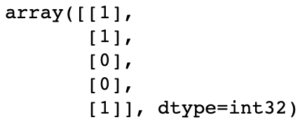
# Checking prediction scores from the model
prediction = fakenews_model.predict_classes(X_test)
prediction[:5]
# Printing out scores
print(classification_report(y_test, prediction, target_names = ['Fake','Not Fake']))

# If the predicted value is > 0.5 it is real else it is fake
pred_vals = []
for i in range(len(prediction)):
    if prediction[i].item() > 0.5:
        pred_vals.append(1)
    else:
        pred_vals.append(0)
# Comparing accuracy between what was happening in reality (absolute truth, y_test) vs predictions (pred_vals)
# from sklearn.metrics import accuracy_score
accuracy = accuracy_score(list(y_test), pred_vals)
print("Model Accuracy : ", accuracy)
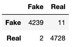
99% accuracy on testing data
# Creating the confusion matrix
cm = confusion_matrix(list(y_test), pred_vals)
cm

# Making the confusion matrix look nice
cm = pd.DataFrame(cm , index = ['Fake','Real'] , columns = ['Fake','Real'])
cm
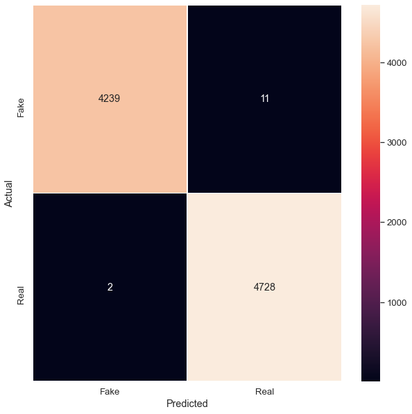
# Getting the confusion matrix to visualize predictions vs reality
# if predictions (1) match reality (1) for truth, then we have TPs
# if predictions is 0 and matches reality of 0, then we have TNs
# notice we misclassified 9 samples as FN and 13 samples as FP
# from sklearn.metrics import confusion_matrix
cm = confusion_matrix(list(y_test), pred_vals)
plt.figure(figsize = (10, 10))
sns.heatmap(cm, linewidth = 1, annot = True, fmt = '', xticklabels = ['Fake', 'Real'],
            yticklabels = ['Fake', 'Real'])
plt.xlabel("Predicted")
plt.ylabel("Actual")
Full Project Repository
Acknowledgements
These are the following resources I used and would also like to thank:
